Feature
Dashboard
A dashboard that finally answered why custom views mattered and what users actually wanted in them: told across three years of restarts.
A dashboard that finally answered why custom views mattered and what users actually wanted in them: told across three years of restarts.
Ascent leverages technology to improve the logistics process.

This case study spans three years, tracking one problem and solution through repeated restarts.

A dashboard that finally answered why custom views mattered to users.

Product Designer

Various PMs, devs, and QAs over the years.

The continuous design voice across restarts, from research to designed concepts.
When I joined Ascent in 2023, the dashboard was already a defined feature in the 2023 iteration of our current product. When our company went through an org restructure in 2024, the product sunset as we transitioned to a newer iteration of the Peak platform with a similar but different feature set and architecture.
In the summer of 2025, our team had capacity to put together concepts for the dashboard again, this time leveraging more recent data to inform how we wanted to shape it. At that time it was decided that the feature would not be prioritized, but we agreed we would revisit it in the future.
That future arrived sooner than expected, in the Spring of 2026, as our team gained broader access to AI tools. Our dev team was tasked with building out the dashboard using Claude, and I paired with a developer to collaborate on a similar but slightly different version of the dashboard. I did facilitate user testing to validate the dashboard's primary functions.
I want to trace the journey of this dashboard because it highlights a lot of interesting moments of ambiguity and evolution of a feature that I had contributed to throughout the years.
In the 2023 iteration of the product, users could add, remove, and modify the size of prebuilt widgets built around different user workflows. I later contributed to this work myself and performed research on it.
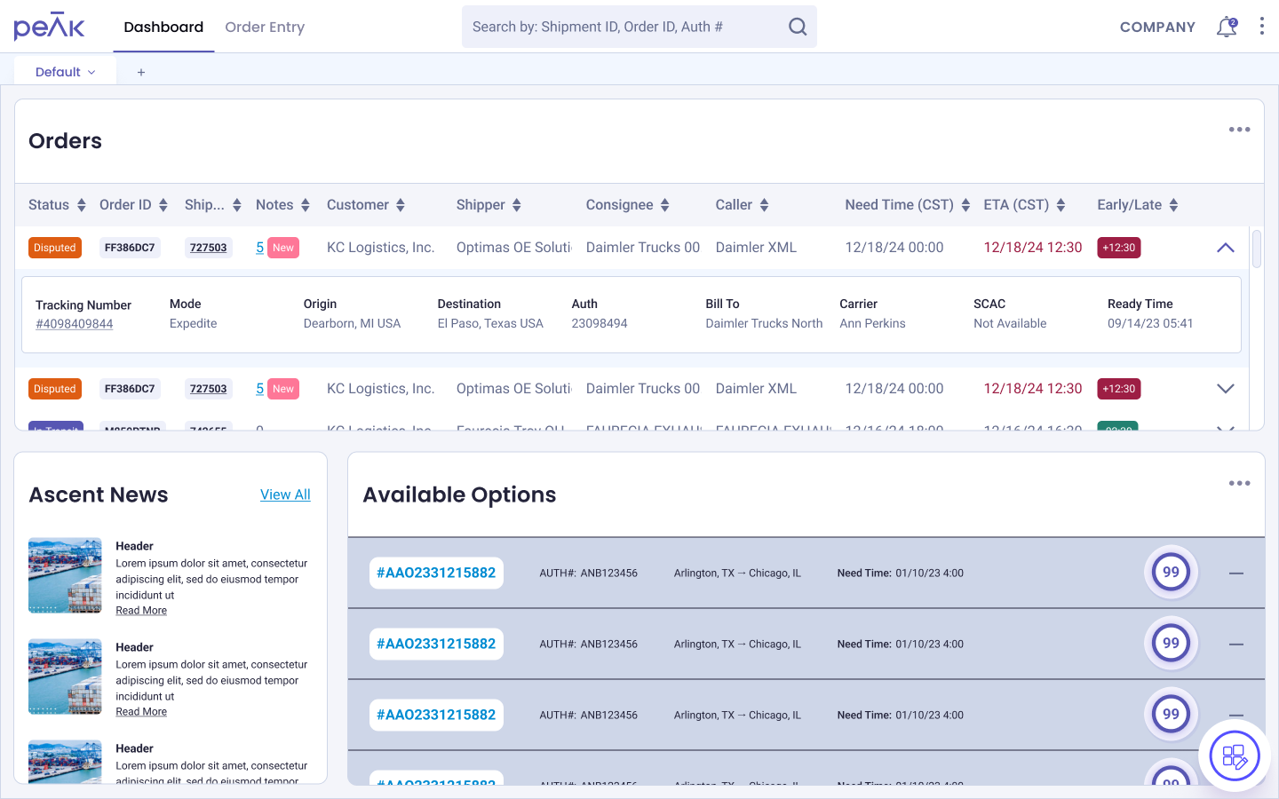
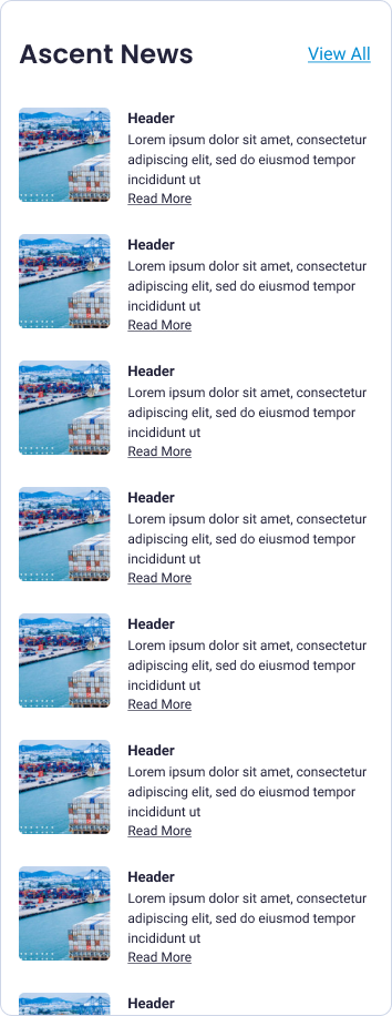
One of the issues with the dashboard was that it had more complexity than the team had capacity to envision. We weren't sure what widgets would be valuable to users. For example, one of the widgets, "Ascent News" which was a retrofit of the company email blast, was often hidden or removed on a user's dashboard. We'd built the groundwork for a feature without first validating whether users needed every piece of it.
Prior to Spring 2026, in the summer of 2025, we revisited the dashboard with the intention of eventually implementing it in the newest version of the product. Structured conversations with operations agents and customer representatives, aimed at understanding what would make the dashboard useful, helped shape the concepts we put together at the time. That work was presented to a larger audience, but it was decided the feature wasn't on the immediate roadmap.
When our team gained access to Claude in early 2026, we received direction to start testing it against feature rich backlog items.
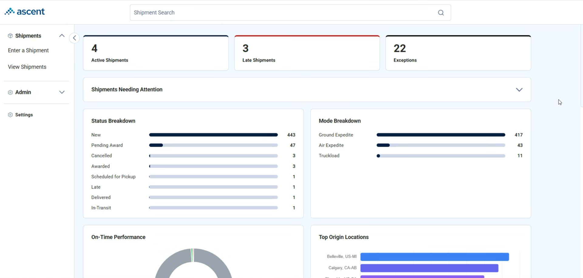
Since we already had a starting point from the earlier concepts, I sat with a developer for the first time to build the dashboard live. It started with me recreating the dashboard in Figma, sending it back to the developer, then screen capping and sending back technical specification while he fixed it on the same call.
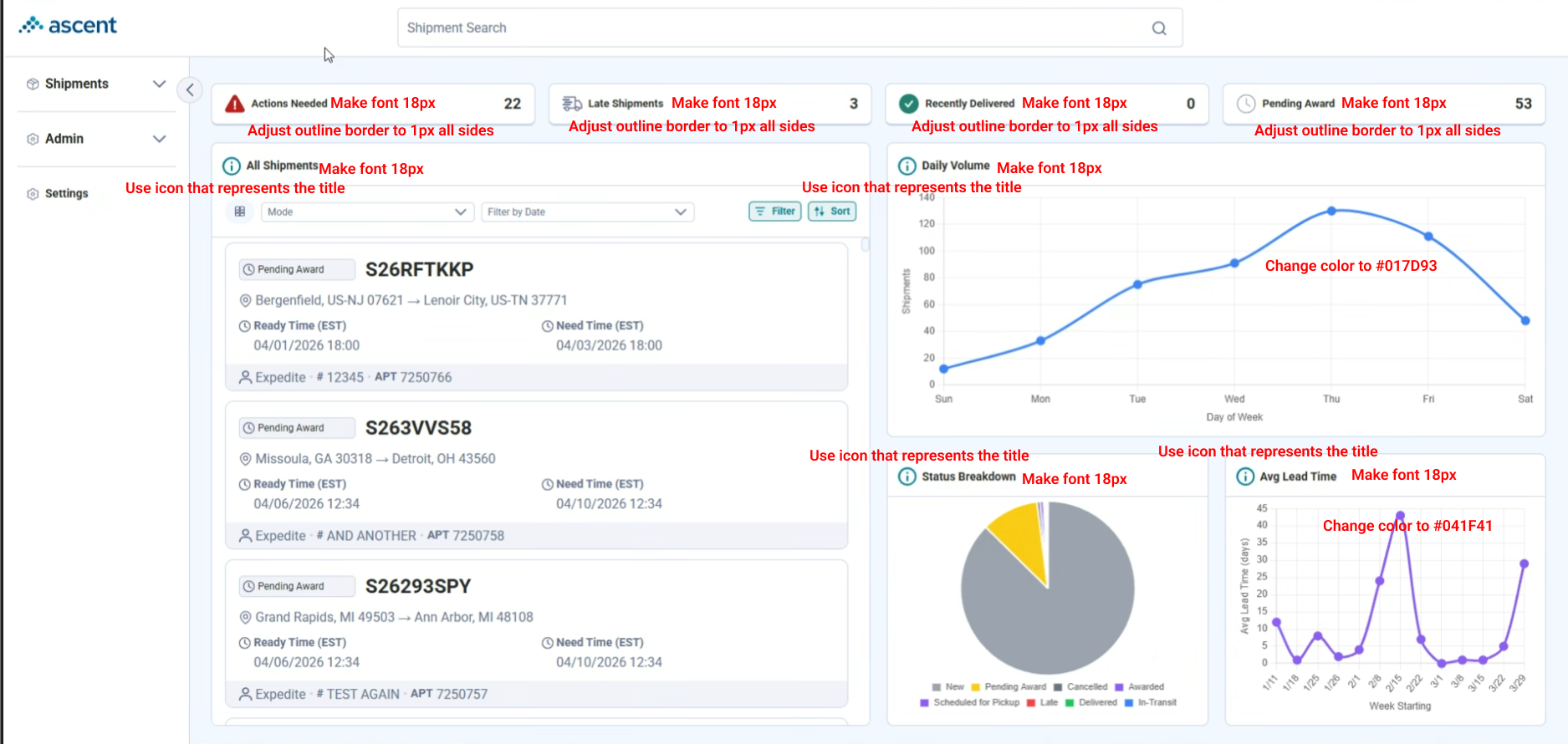
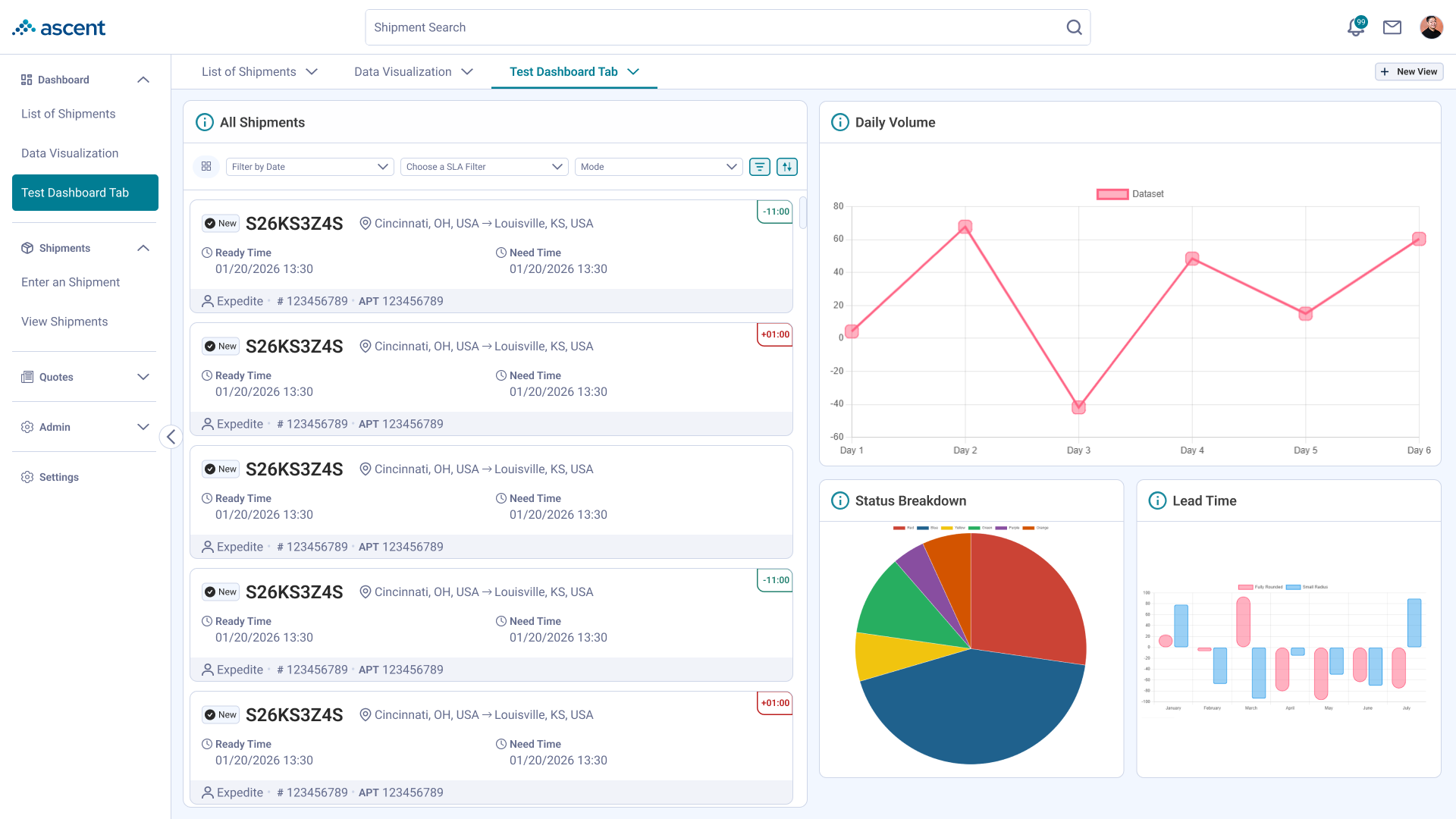
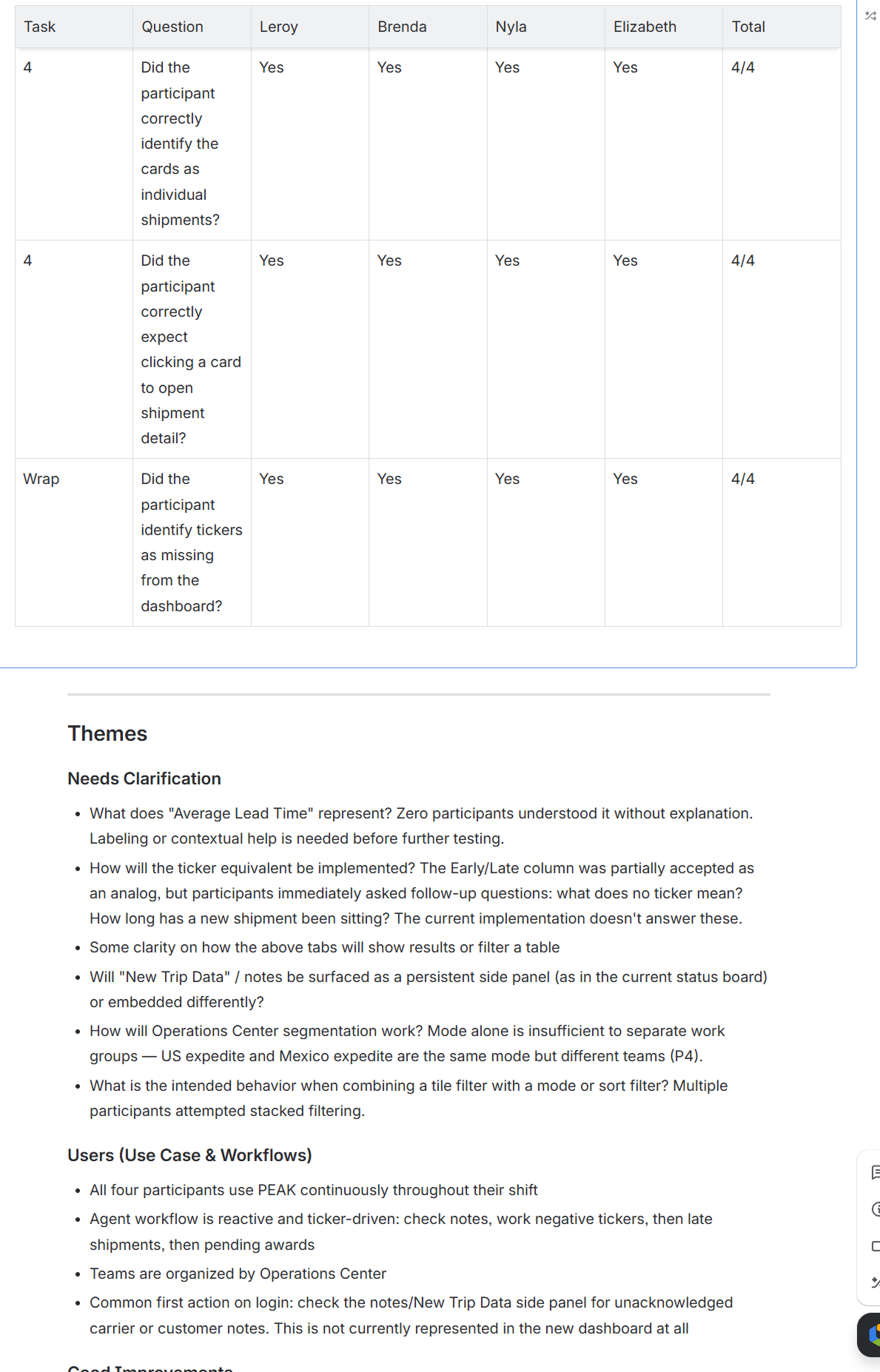
The newest iteration of the dashboard drew on both the 2025 concept work and research I'd previously conducted on the dashboard's workflow, mapping our agents' current workflow of the shipment list, leveraging data visualization for the first time, and testing against new artifacts we introduced in the system. The research goals were: (1) understand how users respond to live data changes, (2) identify whom the data visualization is most helpful to, and (3) validate new visual artifacts that improve space but are new to users.
I performed two different tests across two different user types. The first was a more formal test with four agent users, one in a management role. The second was slightly informal, with our customer representative team, offering insight from the customer side.
Testing confirmed that the dashboard worked, but there were two gaps that stood out. First, the "ticker," the feature used to help them prioritize shipments wasn't present yet. Simply sorting by late wasn't sufficient, the table needed to show which shipments were last taken action for. Second, the word "late" had to be renegotiated in our system (something closer to overdue is how they see shipments).
The biggest finding across both user groups provided clarity on something we had a feeling about: different users have different needs. Operation agents don't have a need for data visualization. Managers or executives on the other hand preferred having the data visualization for reports.
The latter finding revealed something we can finally base our custom dashboard feature on, that we couldn't just provide a stock dashboard for every user.
With new research in hand, I found clarity to whether or not we should have custom dashboards. As a starting place we have a good baseline now: the shipment list and associated widgets for tracking shipments, and the data visualization widgets for report gathering. The widgets that came up as of happenstance, ended up being the baseline.
I carried over most of the functionality we devised in the 2023 design but with slight improvements for clarity and scale. These improvements were ideas I'd developed watching users interact with the dashboard over the years.
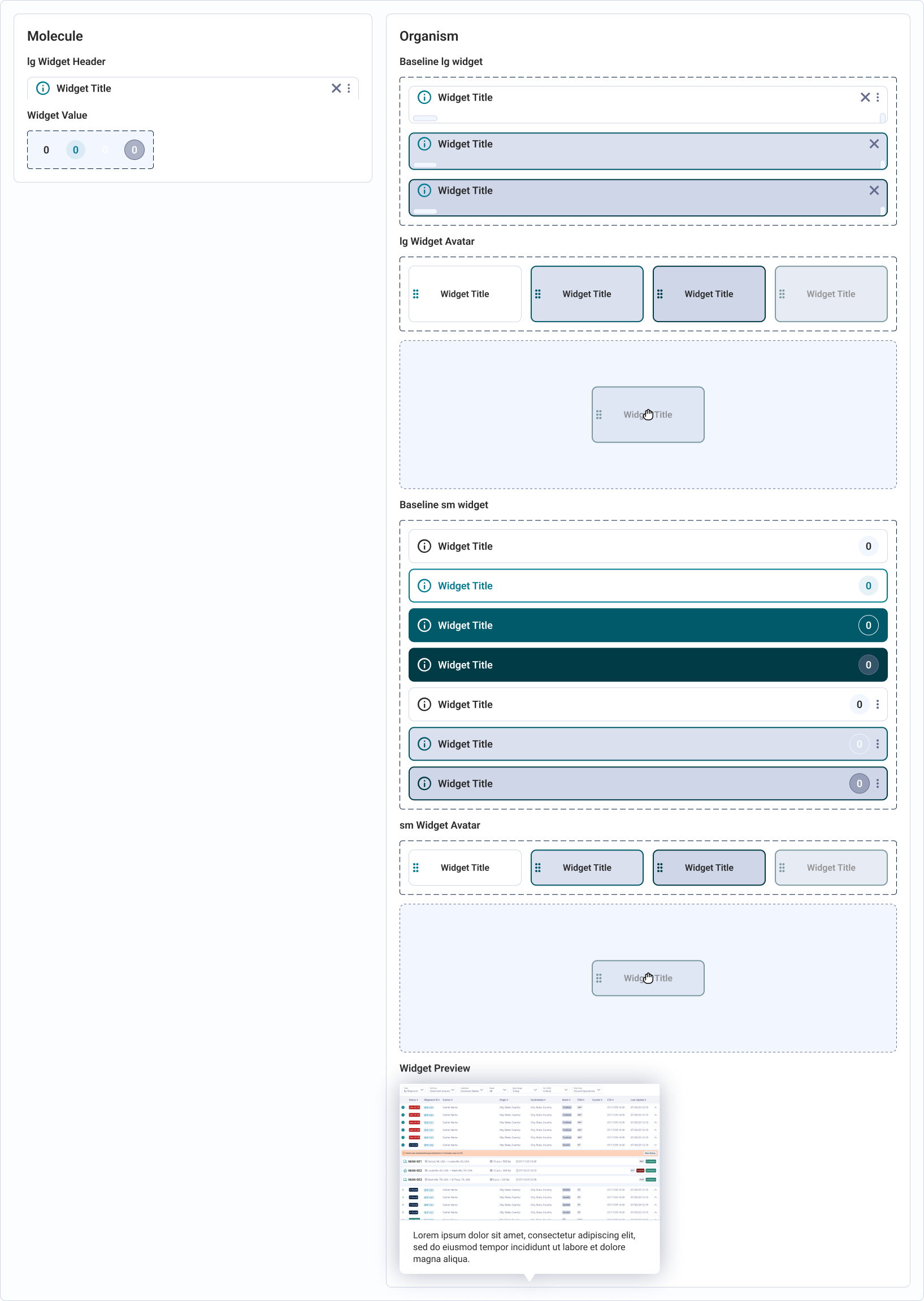
First, providing a mechanism for users to preview tiles to understand what they were for. This was for users who were unfamiliar with whatever naming convention we've used in the past and asked during calls. Additionally, grouping tiles by category and allowing for the side panel to scale as we add more widgets. We could potentially scale to add a search filter, but that is a future problem.
Second, I wanted to make it more clear users entered an "edit" state. I wanted to add guardrails here to make saving or cancelling more clear options (as opposed to forgetting and hopping onto a shipment while mid edit).
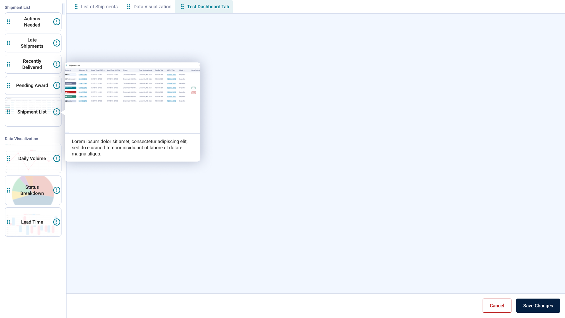
Finally, I wanted to resolve a tension that I felt in our previous design which was switching to a vertical side panel instead of a horizontal one. In tandem with the clear "edit mode" pattern, users can actually scale the actual size of widgets. In our previous version since we had a horizontal panel it reduced the height of widgets during the edit mode. This meant when they saved and the widgets would naturally stretch vertically since the horizontal panel didn't exist outside of edit mode. In this new convention, the widgets can be closer to 1:1 to how they would actually view it on the dashboard.
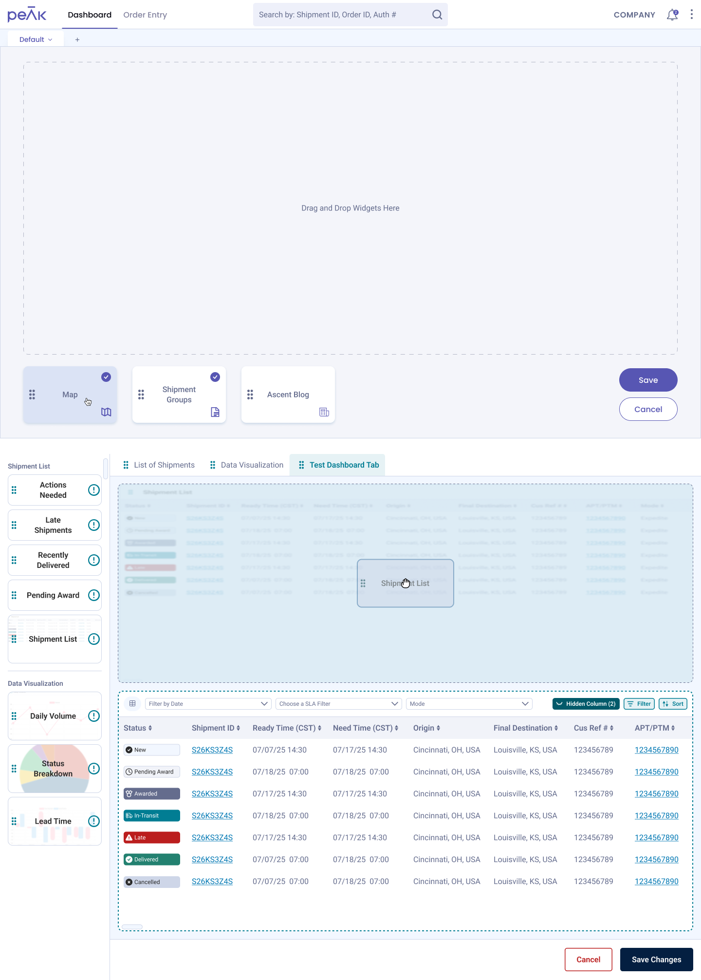
This time we weren't just building widgets. We finally understood why custom dashboards mattered, and which ones people actually wanted.
With the team's dev capacity ahead of the design backlog, I used the gap to define work that hadn't been scoped yet. With my Product Owner's blessing, I responded to bugs that came up in QA and potential areas where the dashboard needed to scale.
One of the larger tickets was defining how the dashboard would scale for mobile and how that impacts dashboard customization. The latter we decided to forgo for now as we learned from our users that those who access the product from the phone are typically working in the field and are likely to look at it for reference.
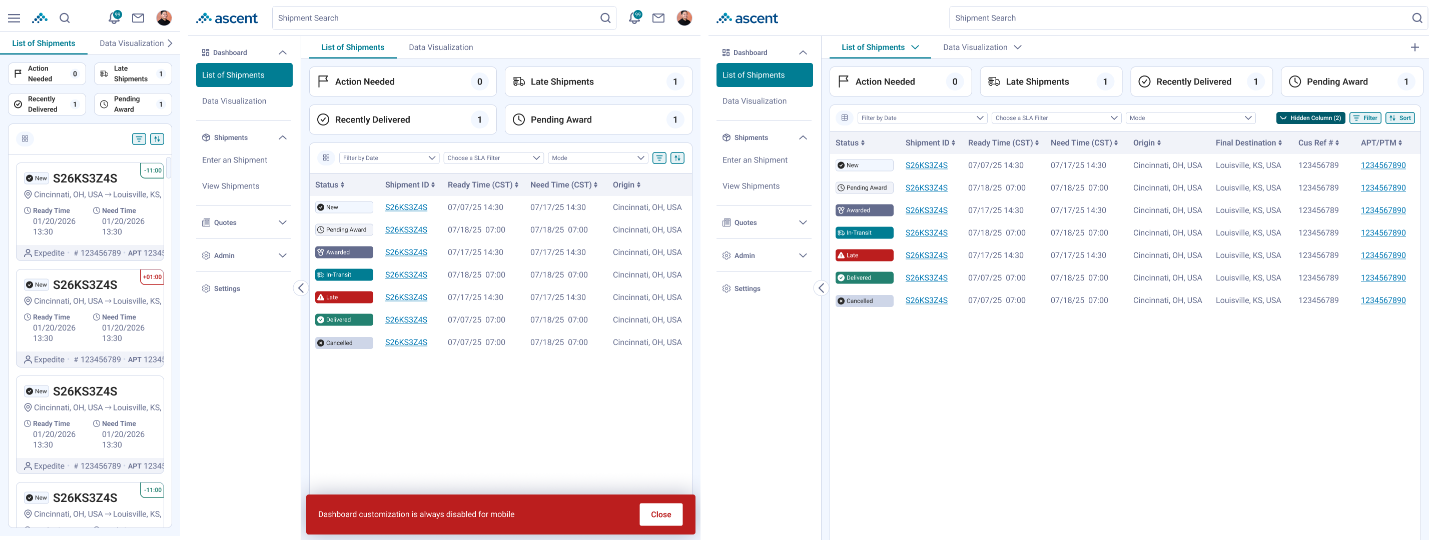
It was during this time that I defined the widgets and the grid logic in our design system as well.
Back then, building anything on the dashboard, especially small improvements, was often a deprioritized backlog item. AI changed what was economically viable to build. I could mock up a small improvement, gather feedback, and let it sit in the backlog until a developer had the capacity, without it needing to compete for priority the way it once did. I learned that things we consider "frills" can now be worked on in tandem with business priorities.
Additionally, I learned that the knowledge I had years ago can still be relevant today. That is more true the longer I work on the same b2b product. The more institutional knowledge I gain about the industry and how that translates to designs becomes a nice throughline in the event we want to spin similar features up again.