Feature
Distance Calculation
Using AI to surface hidden validation states.
Using AI to surface hidden validation states.
Ascent leverages technology to improve the logistics process.

What looked simple needed additional undocumented states before shipping.

A fully documented interaction defining all validation states.

Product Designer

1 PM, 1 BA, 2 Devs, plus stakeholders across two stand-ups.

State-mapping and visual documentation for the updated pattern.
The Origin and Destination containers exist in our shipment entry. They define when an order is picked up at distribution and dropped off accordingly to the customer's preferred destination location. When our product requests quotes from trucking vendors, there are a multitude of criteria that determines cost, and the distance is one of them.
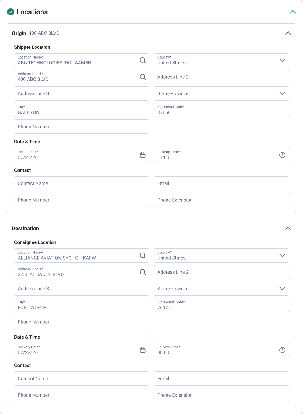
Users prefer knowing the distance before they submit for a quote so they have an general idea of how much it would cost. We have solved for this solution in the past in the previous product when we offered multi-stop (multiple origins and destinations). The difference is that our UI structure presents information differently than the previous one so we couldn't simply copy and paste what we've done in the past.
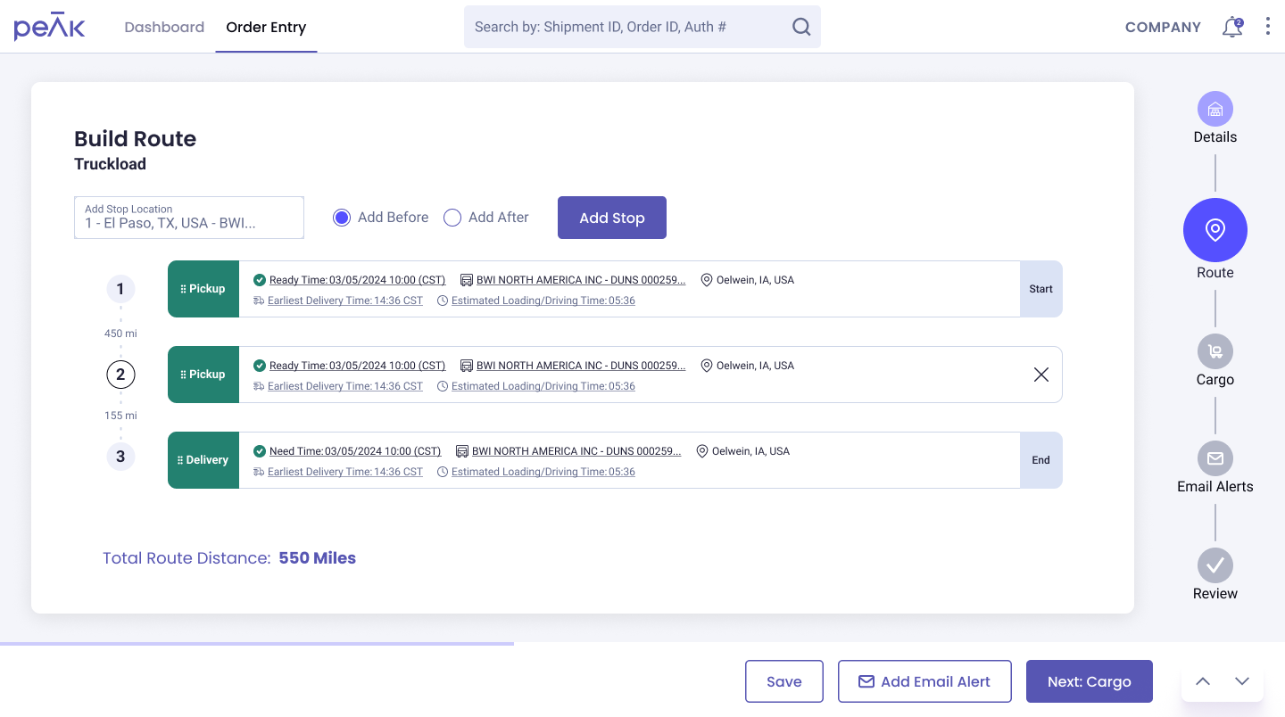
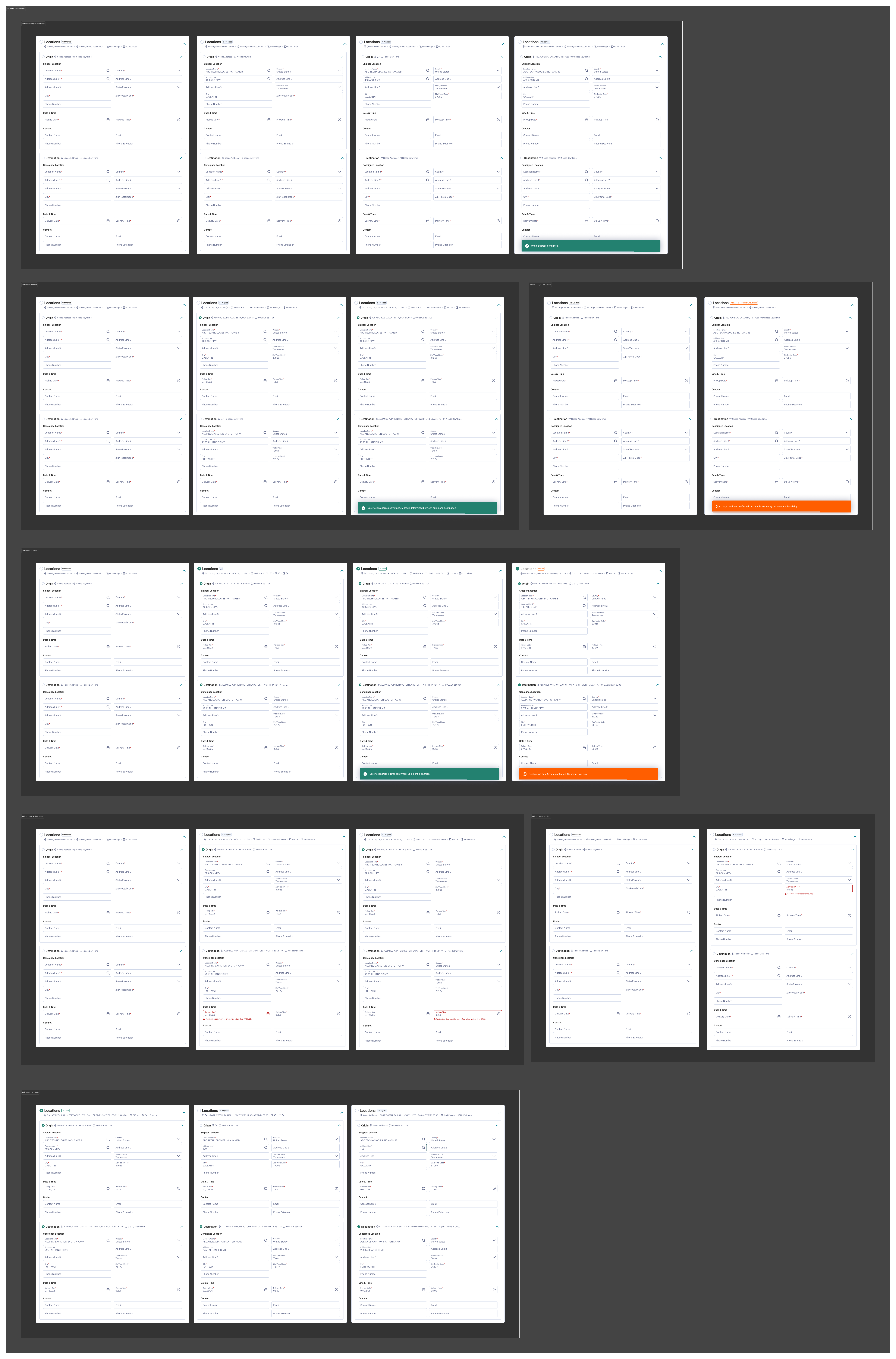
On the surface it appeared that all this ticket needed was a UI representing the distance between Origin and Destination. What complicates this are the conditional and failure states that could occur when completing multiple form fields to determine an output.
While I'm not against the idea of going straight into Claude Code or similar products that generate functional prototypes, I find that for tickets like these, and tickets in general, the general practice should be doing some kind of scrutinizing or interrogation.
For instance, this ask wasn't well defined yet and required some interrogation. While it fleshed out the mechanism for validation (e.g. the calculated road distance in miles or kilometers is displayed on the shipment entry screen), but didn't specify how it was done (which form fields trigger it). The practice of having an undefined ticket at all isn't new, and it isn't wrong. Sometimes teams need to work fast and we don't have all the details up front. What I think is important is that we always interrogate tickets or the ask to ensure we are building the right thing first. I believe this is what leads to faster output because we've talked through a thing at some length.
If you're curious to know more I do talk more about this in my Substack article, Prompting is Designing.
During this period it became a habit for me to use Claude to reorganize or abstract information from the ticket if it was still in a raw state. In doing so I discovered a separate technical document created by one of our devs 3 months prior that defined the affected form fields and explained the underlying logic for the feature.
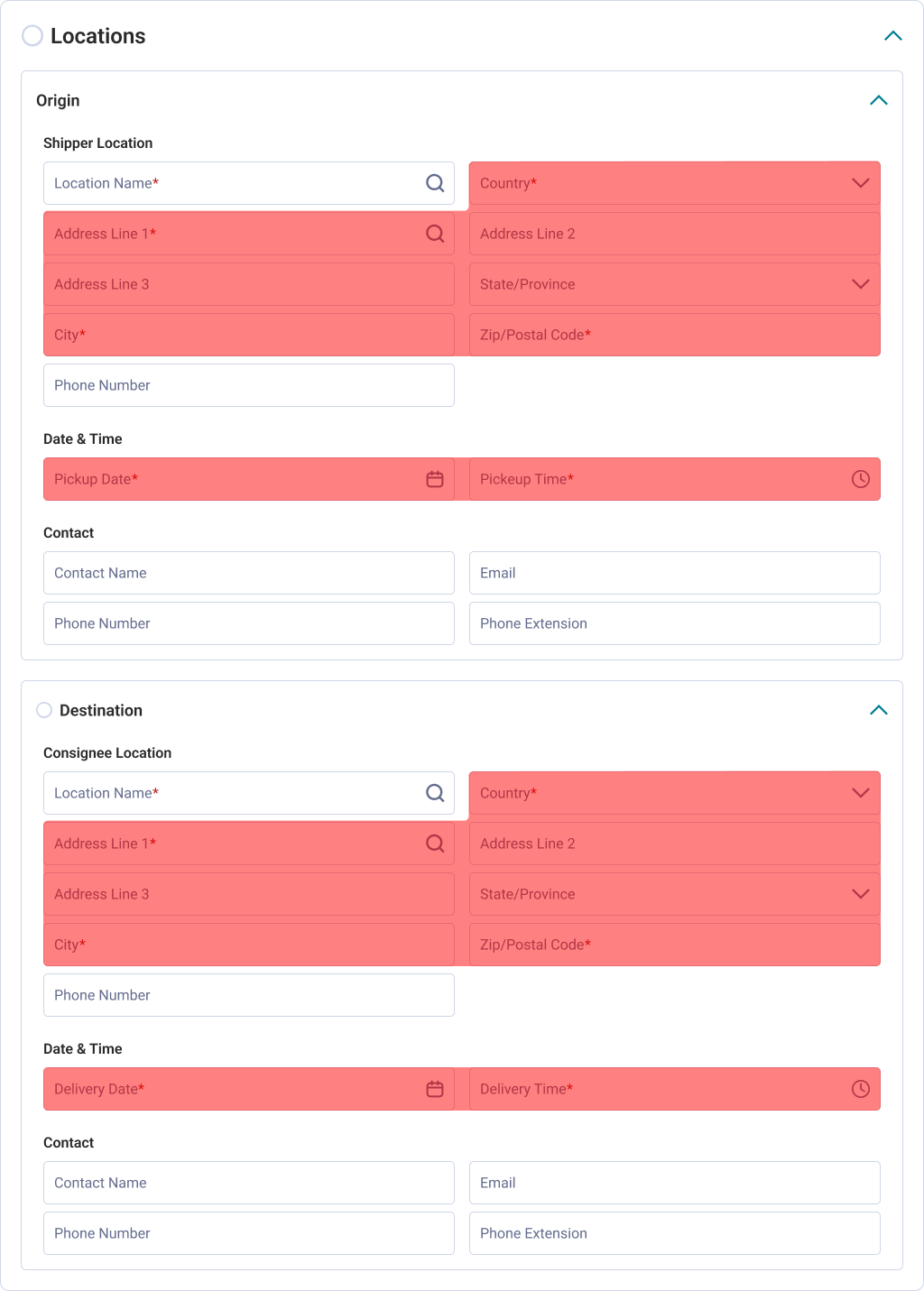
I used Claude to break down the technical phrasing and cross-referenced it against the ticket. From there I gathered my notes and set up a call with my team (PM and Devs) to understand the scope further. Then I would cross-reference my notes through the transcript to make sure I didn't miss anything.

I'm unsure if I will do this for every project, but for this one I did use Claude to help me map out the diagram based on my understanding of the workflow so far.
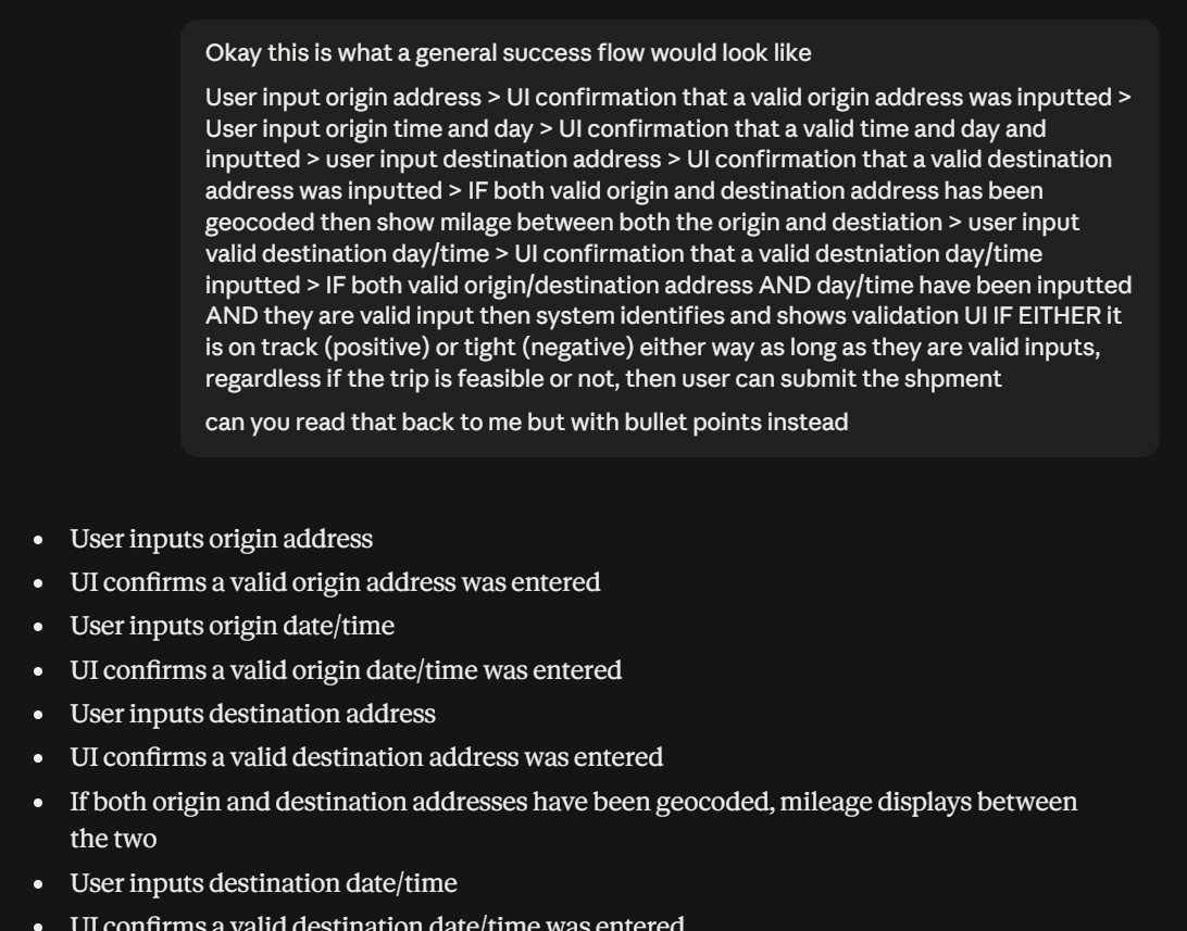
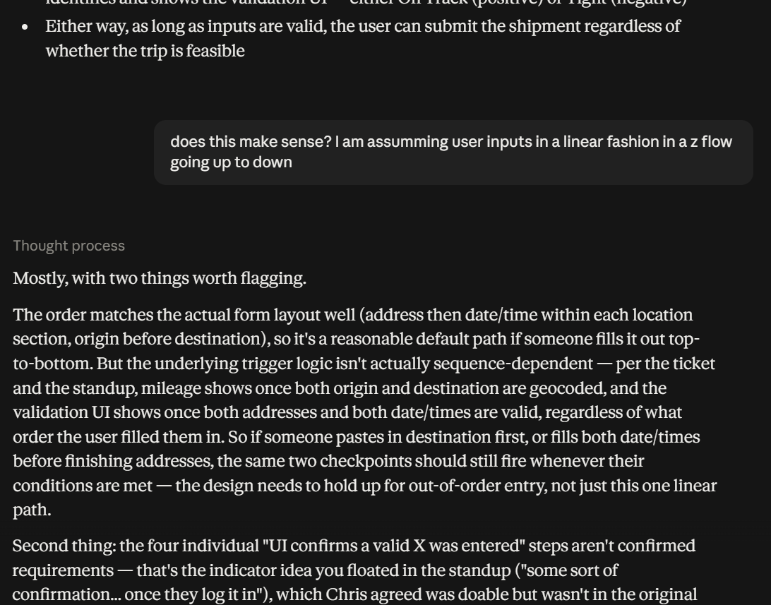
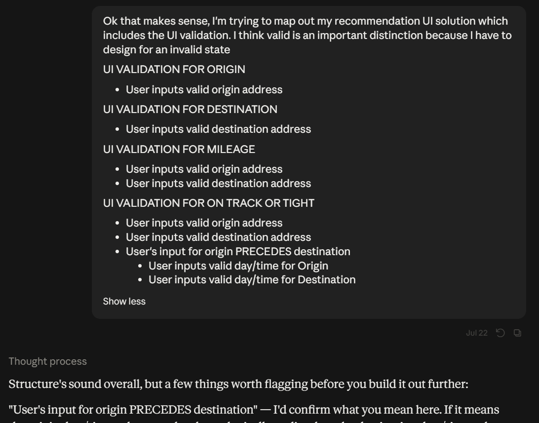
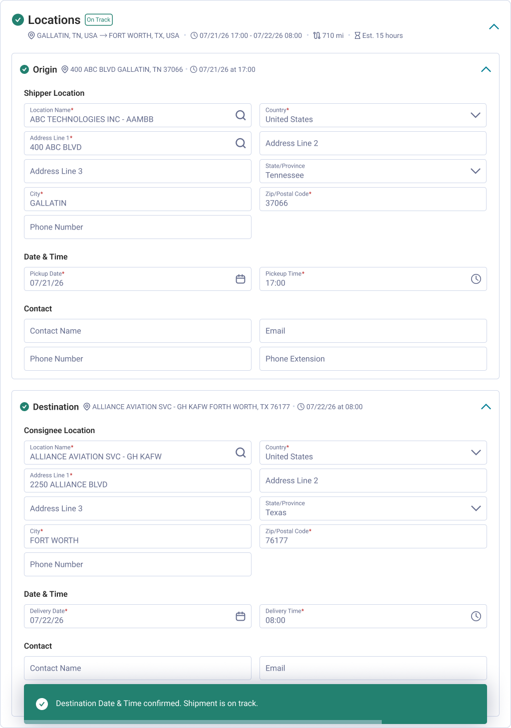
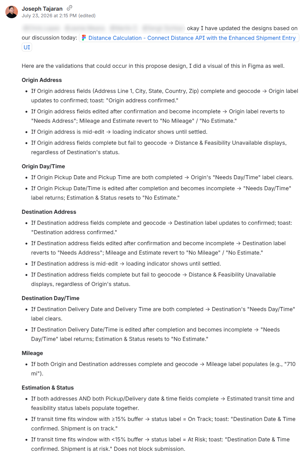
I would go back and forth with Claude to make sure the recommendation made sense, and eventually landed on a success/invalid state workflow which considered all the triggers going off during this feature. In addition to surfacing calculated distance (the miles between origin and destination), one of the examples I found that had multiple conditional states were completing the address group (Country, Address, State, City, Zip Code). Completing these required fields should communicate two signifiers (origin and destination addresses) and on the backend trigger geocoding. Geocoding could sometimes fail, hence there needed to be an invalid state that allowed the user to continue, but the system should communicate this to them. Conversely, if a user inputted a distance that wasn't realistic, we could not prevent them from continuing, we simply needed to communicate that the distance wasn't feasible ("at risk").
As you can imagine, from what started as one state (show distance), evolved until multiple contingent states that depended on: if the data was required, if the data was valid, if the backend could ingest the data to give it a calculation.
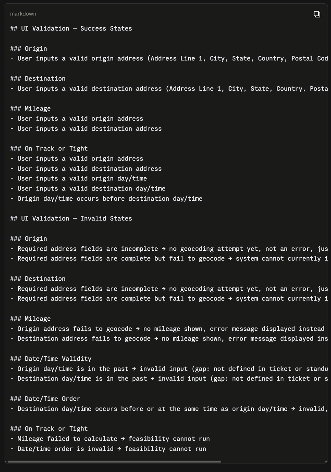
Something that wasn't defined in the ticket was my recommendation to the team: if live data was being generated, we had to signal feedback as it happened. Hence, the output had a valid, invalid, and loading state. I believe if data is being processed, a user needs to know their input is being registered by the system. They need to know the system is working as intended, and the system should provide feedback accordingly.
One of the constraints was operating within the accordion container. How could we provide validation with such a long surface area? It was outside of scope to renegotiate the actual pattern itself, so we were limited to the current component.
A simple solution could be putting the validation message at the end. On paper this makes sense: a user completing this would operate linearly, going up to down. One of the problems with this is that the actual messaging would hide if you collapsed the container and we'd have to renegotiate space in the parent container if we wanted it to be visible. Additionally, since the surface area was long, a user could be completing fields and not know their output until the end. I think it's more advantageous if the data is live, to see it happening live within the same space.
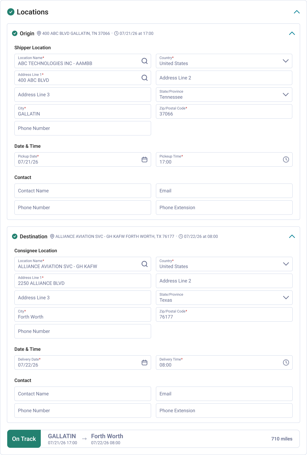
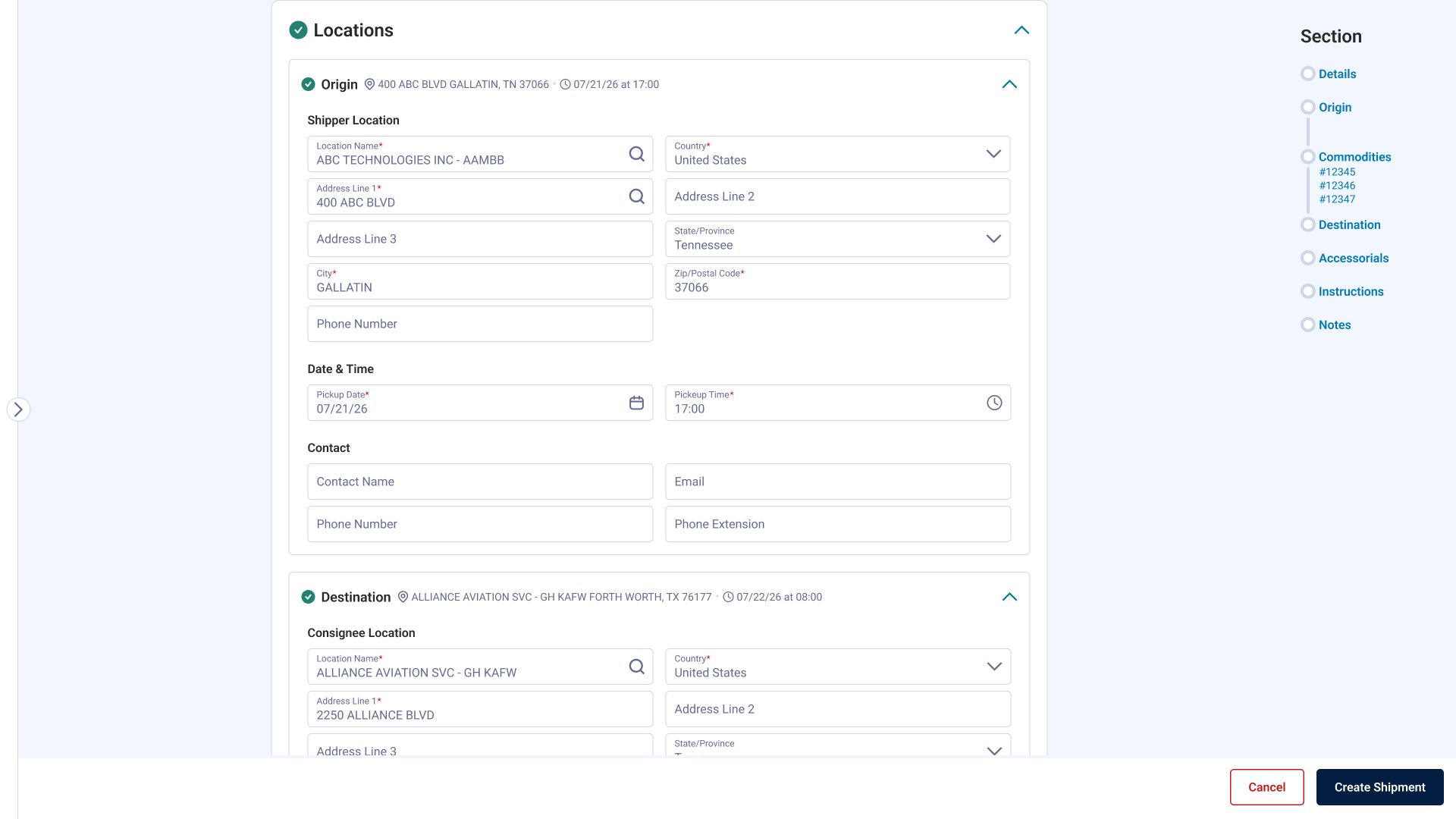
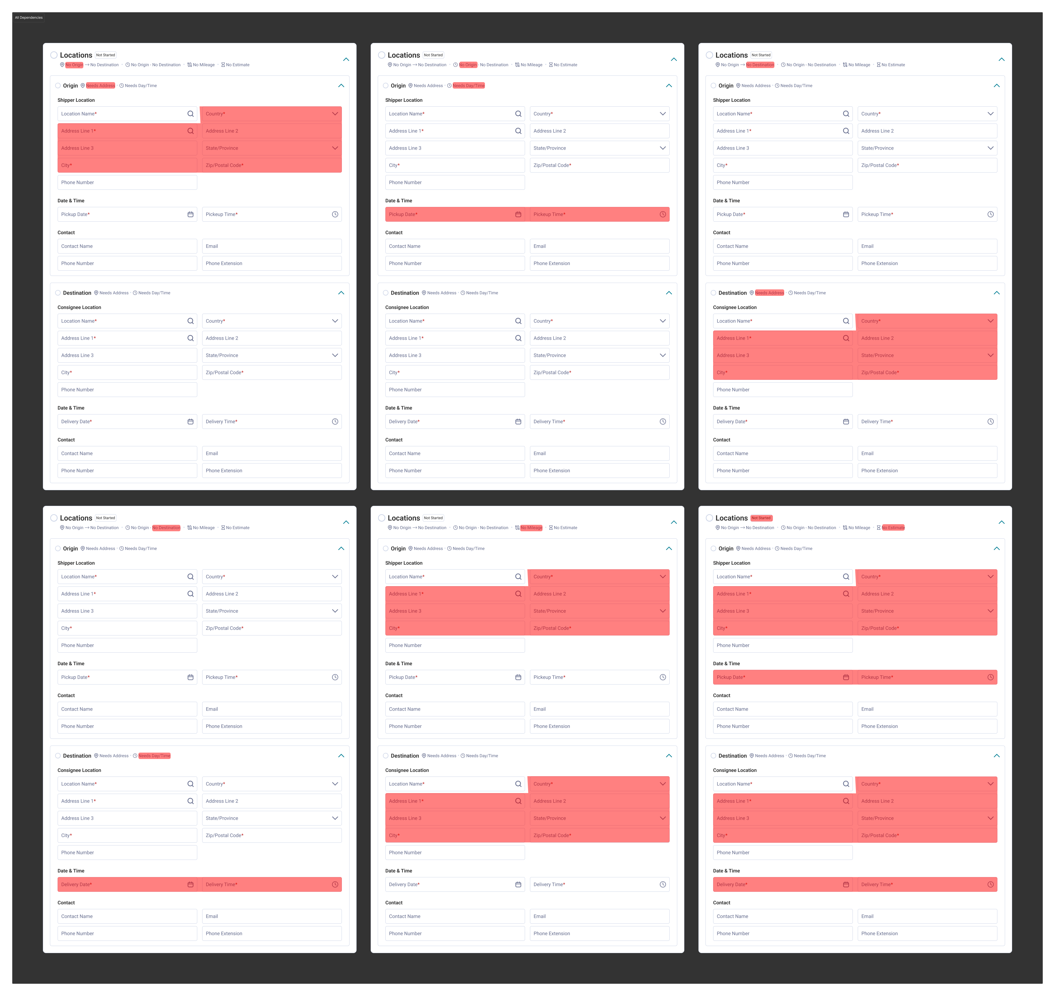
Prior to this feature, the team made the decision to validate only after submission. Now, users will see their validation as they complete the required fields. I wanted to the signals contextual: both in the parent container (Locations) and the child ones (Origin and Destination). As the system does a pass for validation for correct input and validation for form field logic (e.g. your pick up time has to be before your delivery date), users can see their status and input as they are completing the form fields going up to down.
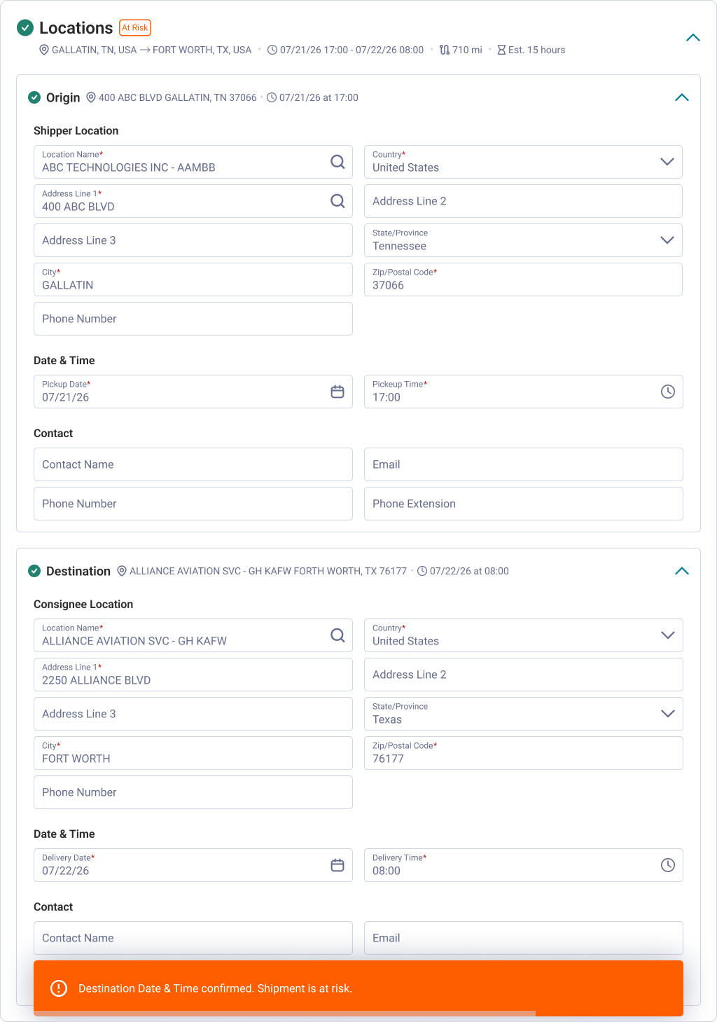
In the deliverable I provided an expanded workflow that was not defined in the ticket, along with a visual of all the corresponding form fields per workflow.
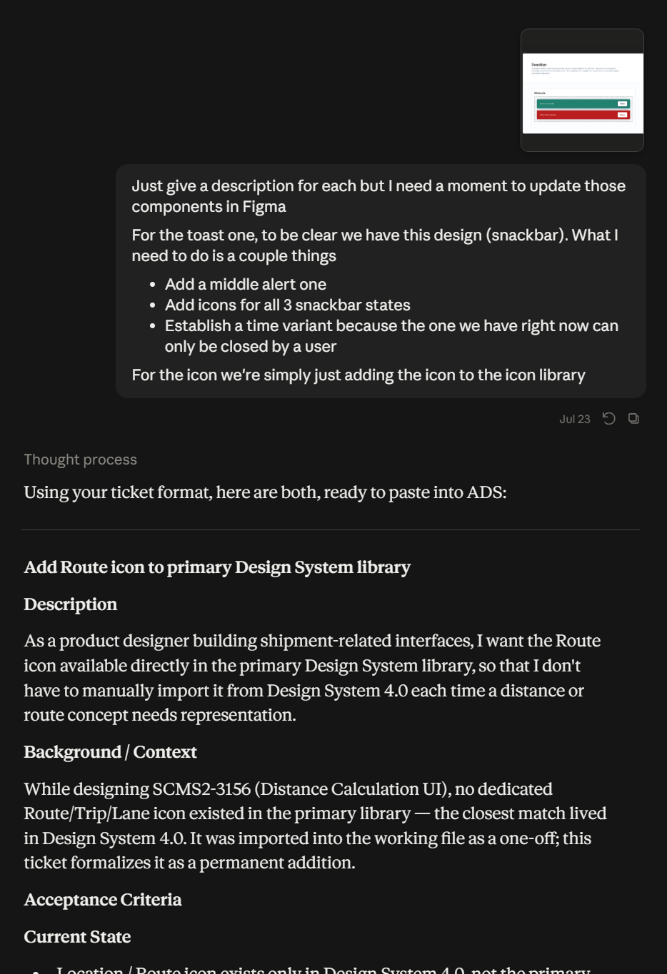
The loading interaction and the timed toast were new/updated components that were documented in our design system. All the other inner components like the badges were already components in our design system. As a result of this feature, the collapsible pattern had a new variant with more validation states.
I also used Claude to write the tickets for our separate design system board so our front-end dev can update the pattern accordingly.
The ticket was assigned on a Tuesday and finished on a Thursday.
Over the year of using AI, I've reached the same conclusion many others have: it's not infallible, and its output needs to be scrutinized. I can see a use for it in going straight to code, but I can't see it for problems like these, where the information up front is still undefined and needs further clarity.
Even before AI, for problems like these specifically, I wouldn't even start clicking and dragging in Figma. I have never found that as a good use of time. I believe the exercise of processing the ask first will always save you time in the long run, not just in the ideation phase. I get that there are designers out there (not naming names, and I'm not saying I'm absolved of this) that appear to be taking more time than it feels like it should to produce an artifact, an output. I believe it's always been the issue of not defining the problem well enough, the feedback loop, or the mechanisms for approval, any of which elongate this process.
Say for example I started just generating stuff in Figma. For some designers, I know that this is a method for processing information and figuring out the solution space. While I'm sure there are issues with my own process, I feel like starting in Figma still constrains your solution space to the UI. If we take time to abstract the ask then I don't have to keep going back and forth with a stakeholder on what validation trigger was missing. Or we don't discover missing workflows until development, at which point they require rework.
This is where I've found AI to be helpful: its feedback loop can provide clarity almost instantaneously. This includes things like breaking down technical jargon, fetching related files in the system not mentioned in the document, and using it to verify if what I'm designing maps back to the ask. In the past I would go to my diagramming tool to map how I would approach designing a workflow. These artifacts are helpful for me to process the solution space and help me work faster. The exercise of prompting Claude to summarize and validate my workflow is the same as diagramming shapes on a white board. The difference now is AI can identify edge cases or scenarios that I couldn't think of in the moment. Not that the output is always correct, but having the option to scrutinize ideas you haven't thought of yet is invaluable. This usually happened in meetings. Now that layer of scrutiny happens on my own before the next stakeholder call.
The time save for me was figuring out the validations ahead of time. That was maybe an hour or two of going back and forth in Claude. The actual design work didn't take long, and we had two feedback sessions before we concluded we were happy with where we landed.