Feature
Shipment List View
A validated table interaction pattern now used as the system default for every table-based page.
A validated table interaction pattern now used as the system default for every table-based page.
Ascent leverages technology to improve the logistics process.

Users needed to sort, filter, and customize dense shipment tables to fit their own workflow.

A validated table interaction pattern now used as the system default for every table-based page.

Product Designer

1 PM, 1 BA, 4 Full Stack Dev, 1 QA.
Led research and conceptualized the design and its various iterations.
Tables are everywhere in data driven B2B products. They are one of the first complex components we can leverage. Tables don't just show data, users use that data to make potentially high risk decisions. At Ascent, Operation users make time sensitive decisions on shipment deployment. Is the cargo on track to their destination? Can they identify when a truck requires triage? They rely on live data populating without delay, as not monitoring a late shipment can cost a customer thousands of dollars.
What looks like four simple interactions, filtering, sorting, reordering, and hiding columns, carries real usability risk once combined. A manager who needs to hold agents accountable for a shipment's status has a very different relationship to that "hide column" button than an agent triaging their own workload. In this project we examined how we might optimize our existing table from AG Grid in our new product line, and validated those decisions with the people who use it every day.
Ultimately, what we landed on was a solution that went beyond this feature; it became how we used this component throughout the entire product.
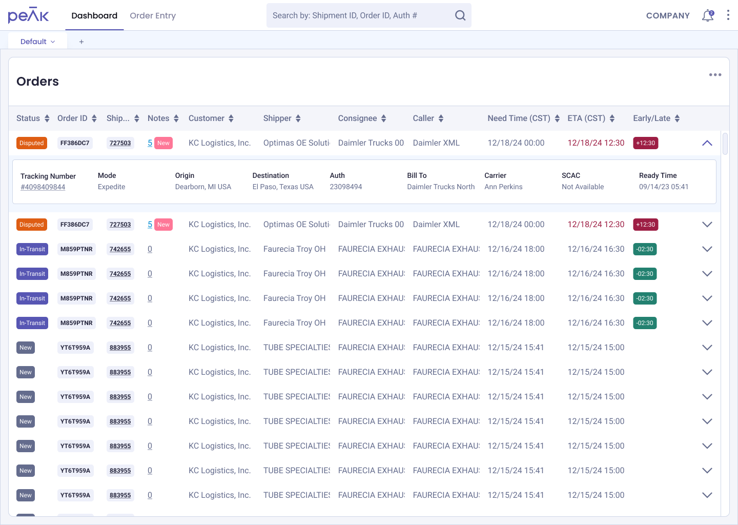
A key gap in our legacy product was that filtering and sorting lived on a separate page from the table itself, breaking the uninterrupted workflow our operations team relied on. This was a feature we knew we needed to bring into the new product, but we wanted to go further than simply porting it over as is.
AG Grid's feature set is already comprehensive: users can search within a column, they can reorder columns, they can sort, etc. We could have easily moved forward with what was out of the box, but the team identified necessary experience refinements that best fit our primary users who monitor shipments through the table: our operations team.
The operations team uses the table as their primary object. They check it throughout their shift. Each group of agents is assigned to "pods" which are a cluster of agents who are dedicated to a specific customer or customers. Every agent and every pod has their own unique workflow and needs, hence the table needed to have customization features that fit their use case.
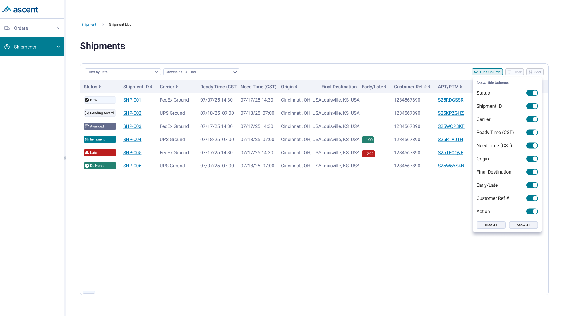
Customization occurs in some of the more baseline table features: sorting, filtering, and hiding. Features that already existed out of the box via AG Grid, but lacked the experience rich features our agents needed to make time sensitive decisions.
The goal was to identify how we might provide these customization options and ensure they are embedded as part of their workflow.
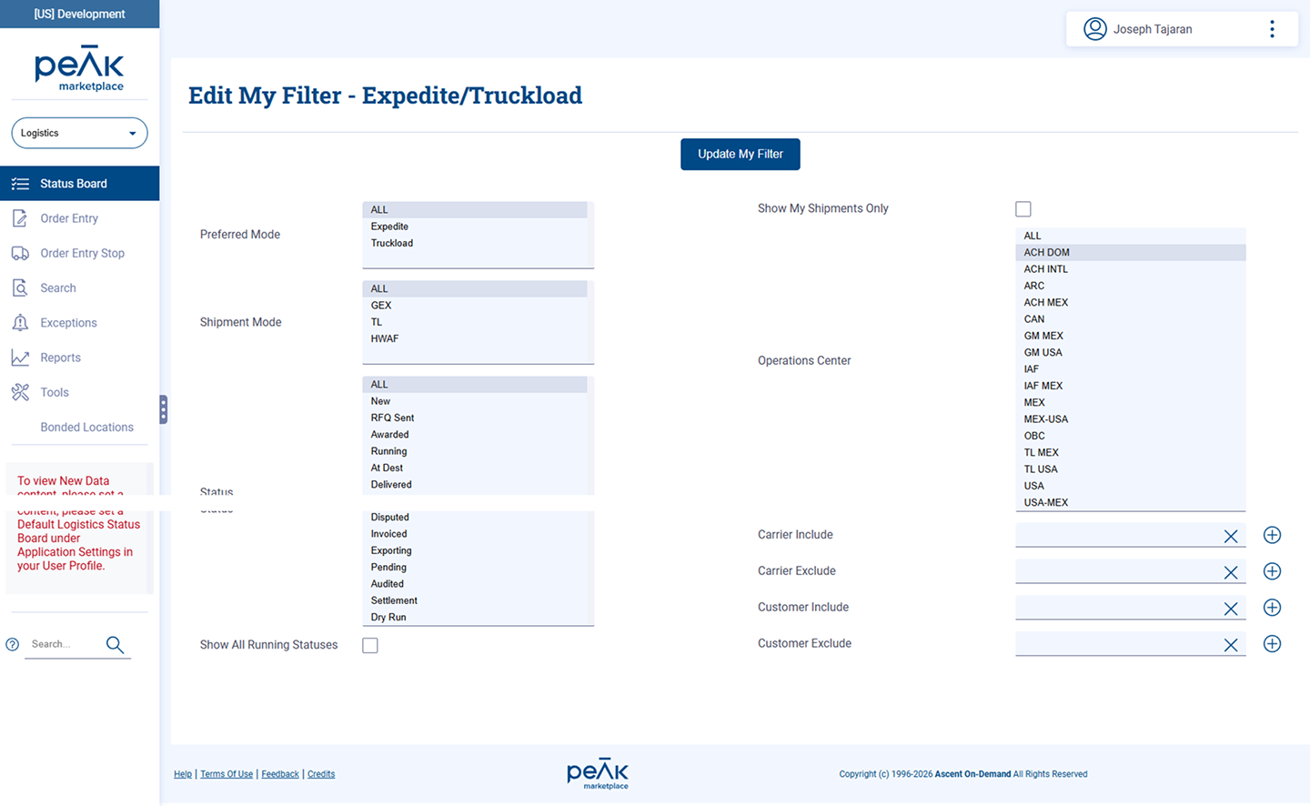
I believe the primary issue I had with AG Grid was that it didn't do a good job communicating affordances. It wasn't immediately clear when a sort, filter or hide was enacted on the component. From prior research with our Operation agents, their workflow was primarily different windows on the same screen. Rather than clicking through the product they would have separate windows showing different states of the system: the table list, several shipment pages, email. Doing this allowed them to keep track of any minute-to-minute changes that may come up as they multitask. Lacking clarity on whether an action was done increases the noise, and I wanted to reduce any guess work that would happen in an actual Operation user workflow. Persistent visual confirmation of state within the same screen (what's filtered, sorted, etc.) helps streamline this.
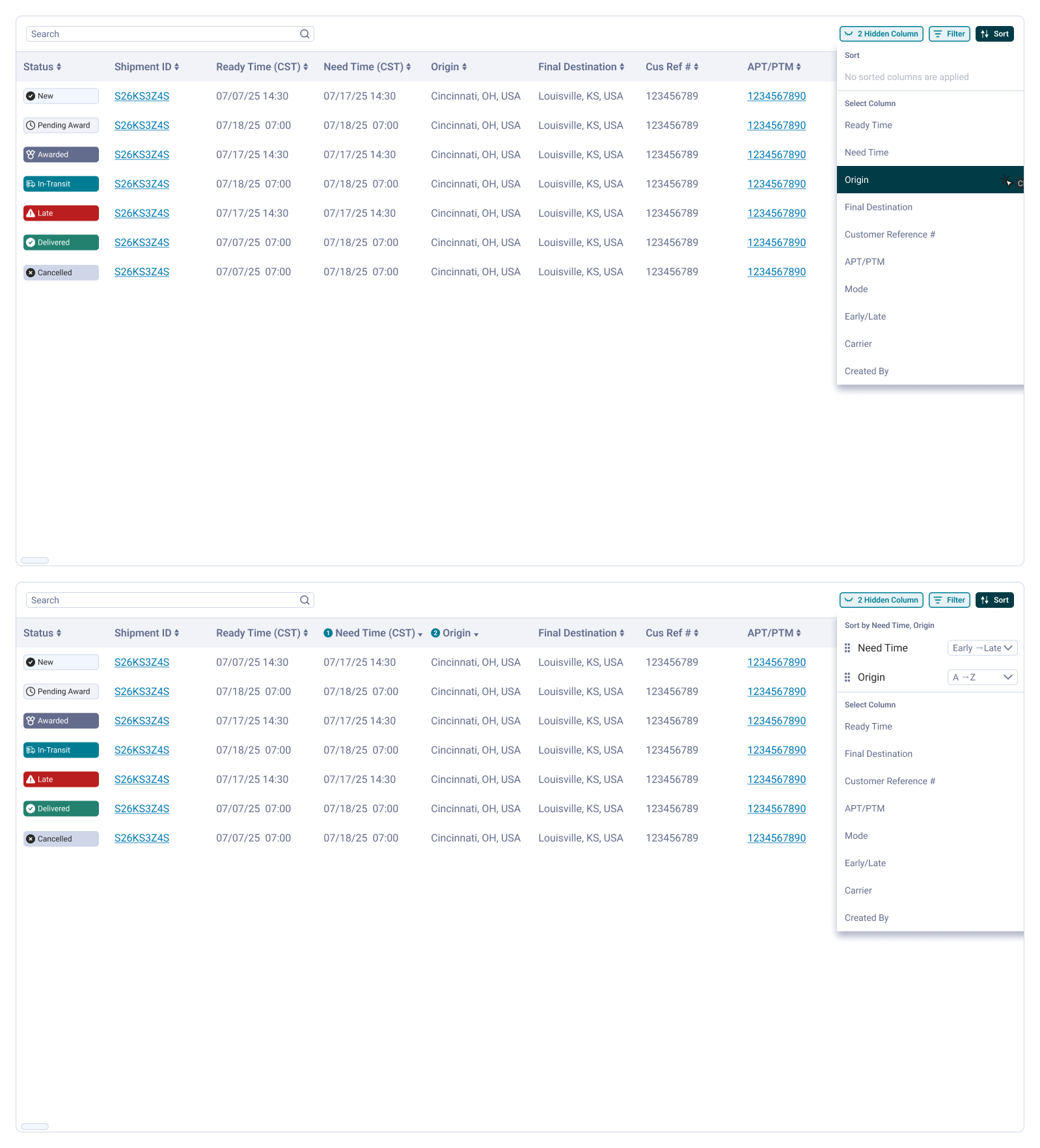
I landed on a conventional solution: establish a table tool bar which managed hiding and communicated states for sorting and filtering. So when a user interacted with an individual column, they were able to see which column was being affected with an option to undo it. A simple interaction but an important one that grounds the user to where they are currently and gives them insight on what interactions to perform next.
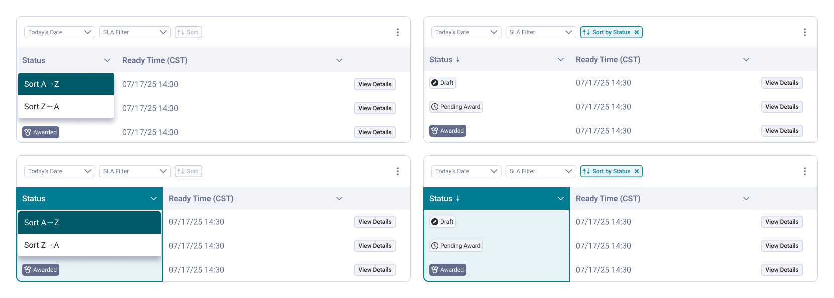
Since the dev effort was going to be somewhat large, we didn't want to build on assumption so I proposed running some usability tests via a Figma prototype through some of our business units to verify that we were on the right track. I was limited by time and resources and was able to talk to 3 users with a couple who were in managerial roles but had experience as operators. The usability goals were: (1) do users understand the new filter interaction, (2) do users understand the new sort interaction, (3) do users understand how to reorder columns, and (4) do users understand how to hide or show columns.
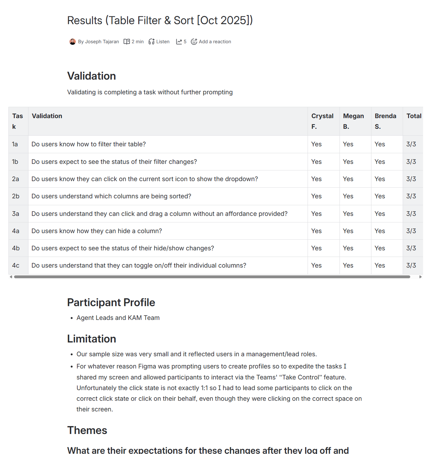
All four interactions were validated across all participants. However, the more useful outcome was what surfaced alongside the pass rate.
First, users identified a potential risk of giving the option to hide the status column. The status column is the most important data to look at when they make a decision and it was important not only for accountability (agent can't say they missed it because it was hidden), but also it's a necessary guardrail as there is no need to hide this column anyway.
Second, we could potentially expand on the tool bar further and not have it only communicate affordance, but provide further interaction at the table level. So instead of having to click through each column, users could not only hide, but also sort and filter at the table level.
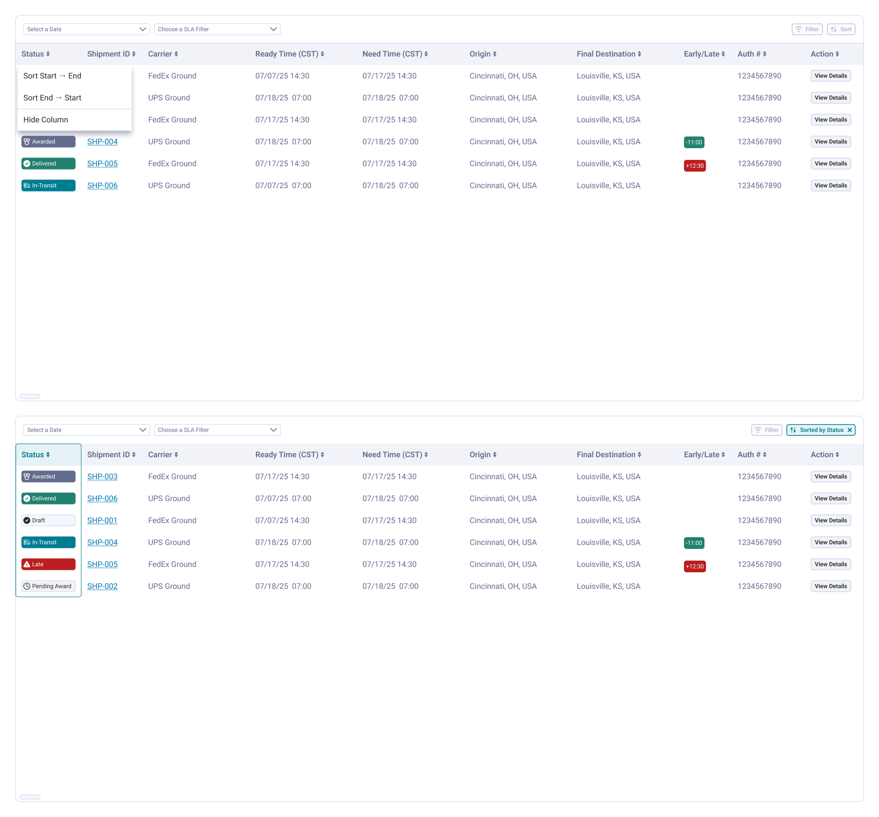
In addition to an affordance being clear, we reconsidered adding more depth to the interaction. After we launched the initial scope of this, leveraging the research findings, we decided to expand the feature further by giving users the option to perform interactions at the table level.
Transitioning from column level to table level interaction raised two challenges: how to track state across the whole table, and how users would perform multiple types of interaction within a single control. We would have to consider column based interactions and more: selecting a filter/sort, defining criteria (e.g. start to end), and defining priority.
In the months that followed we made incremental changes to the table based on feedback from our weekly sessions with our pilot users and from our business priorities as well: searching for values within a column, and mobile responsiveness.
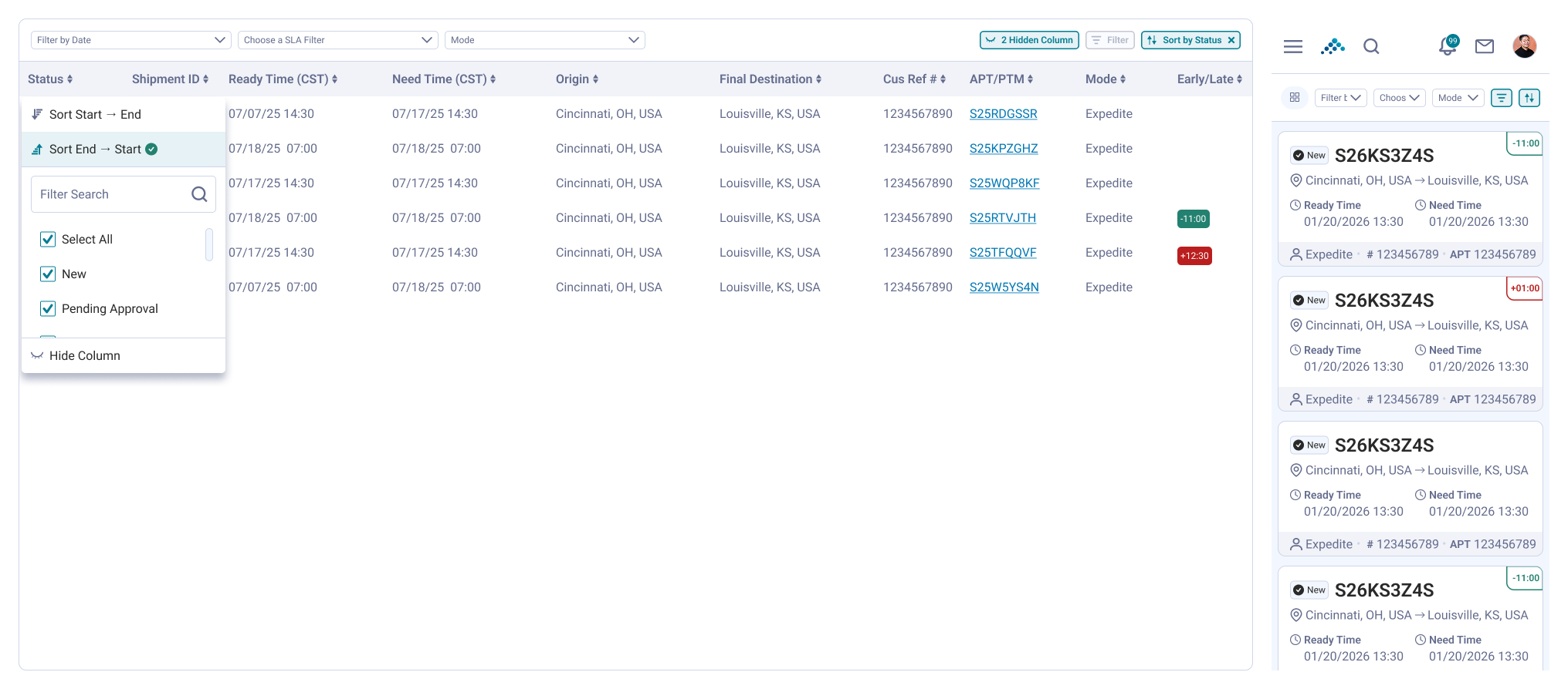
The feature set we established in the shipment list was broad enough that it simply became our go-to component for most areas of the product.
While I don't have formal metrics comparing this to the legacy experience, I've sat in on sessions with operations agents using this pattern across different pages and haven't seen anyone get stuck on the filter, sort, or hide interactions we validated early on.
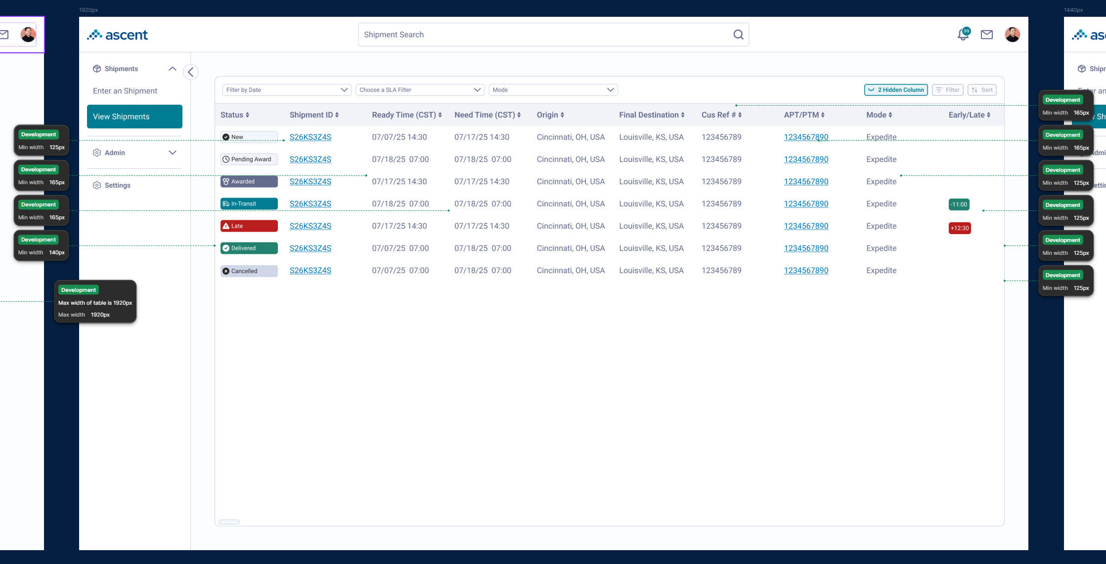
The table is ubiquitous in design: it exists everywhere in B2B and elsewhere. There have been many solutions for tables in the wild, even to the extent where you can sell it as a solved component (via AG Grid), but if your user base is niche enough, I believe it's more interesting to understand their specific use case and how to tailor the component to their needs. An agent looking at the table for live shipment data is of course different from a board member looking to see how many shipments we're getting in general. We sometimes surprise ourselves on how unique users interact with common components.
With more time, I'd want a sample weighted more toward frontline agents rather than leads, since their day to day relationship with the table is different from a manager's, and that gap is exactly what the accountability finding surfaced.